Lesson 8
CSS Properties
OBJECTIVE
Learning about the Box Model is crucial because this is where all your content formatting begins and ends. Just like a magazine has articles and pictures, they must have order so they can look visually appealing to the user. Below we will learn how to use the Box Model method so your boxes can line up with each other side by side, and create spacing around the content to keep text from touching the sides.
PREREQUISITE
Prior knowledge of basic CSS properties and advance HTML. Now it's time to put those properties to use for your Box Modeling.
First of all, what is a Box Model?
A Box Model is where your content sits in and can have many assignments set to it to add spacing around text, add spacing around the box to separate it from other boxes near by, or to stack them up next to other boxes.
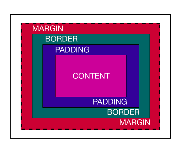
There are four major parts to a Box Model which I have colored coded the text to match the corresponding part.
Content - This is where your text or picture sits in.
Padding - Defines the spacing around your content to keep it from touching the sides of the box which looks very ugly and unprofessional.
Border - Your boxes can have borders with colors, styles, and even rounded corners called radius.
Margin - Margin is great for adding that negative spacing between other boxes and can help keep your layout clean and clutter free.
Ok..Now that you know the basic anatomy of the Box Model, it's time to see it in action as the examples below will give a nice visual.

CSS Rules For The Model Box
These are the standard rules given to a Model Box or for a group like a gallery. Creating a mini gallery is the best way to learn how these boxes work.
